WATCH: Missouri officially reveals new design for football helmets
Defensive back CJ Boone may have let the cat out of the bag a little early when he posted a few images of the new Missouri helmets on his Instagram account this week.
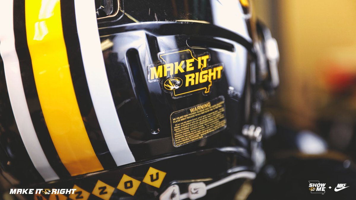
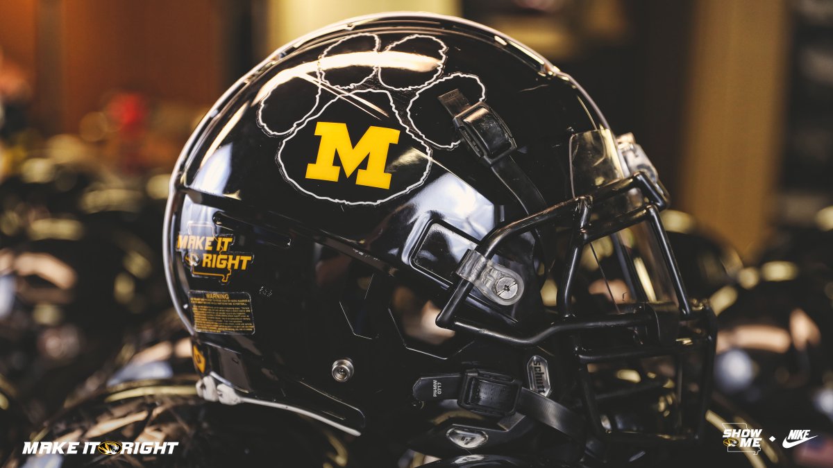
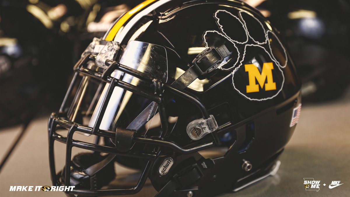
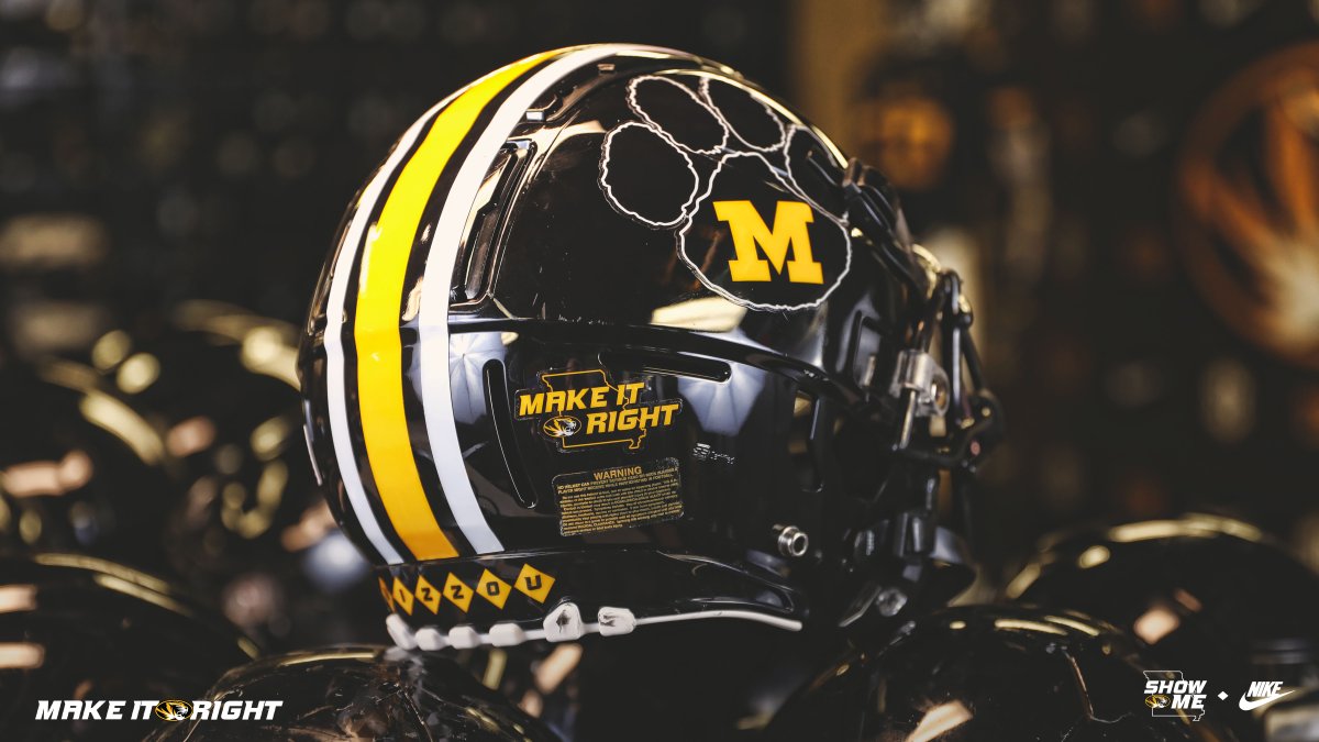
Heading into this weekend’s Missouri spring game, the Tigers have a treat for fans that make it out for the game as the team has just officially given fans the first look at the team’s new look helmets featuring some bold stripes.
This adjustment may be slight but it’s a nice one for the Tigers heading into 2019. The clean and bold stripes really make that helmet pop as opposed to the former design of the helmet. The helmet also features the “Make It Right” sticker shown in Boone’s video.
Check out the video below:
Oh, and that stripe is sticking around for awhile ‼️ pic.twitter.com/XucjxRFG4V
— Mizzou Football (@MizzouFootball) April 11, 2019
Here are some images as well, shared online by Mizzou’s official football Twitter account:
What do you think?
Disclaimer: not a Mizzou fan
I never thought they had the best or the worst look. But this doesn’t seem like a step forward, and might be a step back. My first thought looking at the pawprint and M was that someone fused Clemson & Michigan.
Most importantly, they just spend way too much time looking in the closet and deciding what they are going to wear today. Odom has a lot of good psychological coaching planks in place at Missouri, ‘dress for success’ however is WAY over the top, and winning the division or the conference is a lot harder with distractions.
I’m very certain that Mizzou can decide on uniform designs without taking anything away from odom’s football preparation. Its laughable that some of you guys think uniforms are distractions. I love what Mizzou has been doing, and I think the players do too.
And for all you guys saying it looks like Michigan, that’s exactly why mizzou rebranded to the tiger logo. The block M looks indistinguishable from every other school located in a state that starts with the letter M.
Ok, I’m glad there are fans that like the M. I liked it 50, 40, 30, years ago etc. myself. We all know that the roster doesn’t drive the uniform craze, but the fact that it happens leads mental prep away from the center line and ANYTHING that disrupts focus can’t be good, thanks for your opinion all the same.
This was the logo Mizzou used through much of the ’80s, so it literally is a step backwards, though I would argue a good one.
Gone are the days of Black and (old) Gold. Okay, whatever works, right? Yellow uniforms with black pants are tolerable once a year, but please, please, PLEASE NO WHITE PANTS AT HOME!!! This is why we lost to Kentucky. That was a personal foul for bad taste)
The striped helmets were fine in the 70’s. These are the 2020s. The M can stand for anything from Minnesota to Michigan to Oklahoma coaches mullets. Now-a-days we have a unique Tiger symbol. It’s a great one and a durable look. Paw prints are about 4th grade-ish.
I agree. They should keep the tiger logo but ditch the paw prints.
So, it is sort of a combination of an old and new look.
Kev, yes. Wish, wish we would reinstate the block M of yesteryear. It’s classy & carries tradition. Wanna get crazy with it, go with flat black helmets gloss black block M.
Black on black looks awful. Thankfully you old goats aren’t in charge. The block m is fine but wasn’t used for most of mizzou’s history so I wouldn’t call it “traditional”.
That paw print logo makes it look like Dollar-store Clemson
funny
Why do you insult dollar stores by comparing them to Clemson?
I’ve lived in St Louis long enough to have seen a few helmet changes at Mizzou. I’m more old school but I have always loved when Mizzou had just the block M.
The black helmet here with bold stripe and M in the paw I think looks sweet!
The white helmets are pretty killer.
If that’s a ‘trade-marked logo’, Clemson might have an issue with it. The last thing Mizzou needs is more legal trouble.
Clemson can’t trademark a paw print in general. Theirs is very specific down to the exact shape of the outline and the tilt.
Mizzou has had that logo since 1983. They’re not just pulling it out of thin air.
Yeah I have seen it used before