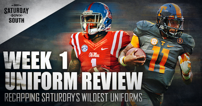
Week 1 of the 2016 College Football season provided a first glimpse at teams’ uniforms. Some programs unveiled new ones. Others made modifications to their old ones.
Here’s a look at the good, the bland and the downright ugly from the first weekend of College Football.
The Good
Oregon
Innovation and dedication epitomized by a uniform. #GoDuckshttps://t.co/6iSqvzloyd pic.twitter.com/2LbRNkOiSo
— Oregon Football (@oregonfootball) September 3, 2016
No surprise here. Oregon has numerous uniform combinations and all of them are excellent. But what else would you expect from the alma matter of Nike chairman emeritus Phil Knight?
Michigan
Michigan's new Jumpman uniforms are LEGIT.??❄️❄️ Love them. pic.twitter.com/6EvK9sIpPJ
— SCOTT WARNER (@ScottWarner18) September 4, 2016
Jumpman Jumpman Jumpman Harbaugh’s up to something. One of College Football’s most iconic uniforms received some nice modifications after joining the Jordan brand. His Airness was also in attendance for Michigan’s season opener at the Big House.
UNC
Nick Chubb carried #UGA with Heisman-worthy performance in 33-24 win over #UNC. https://t.co/yhO9s8uT9q pic.twitter.com/eBNvCooWqE
— 92.9 The Game (@929TheGame) September 4, 2016
Jordan’s alma matter also featured some excellent unis on Saturday. The UNC baby blue is just too nice not to include. The argyle stripe was a nice touch on the helmet. Unfortunately, it did nothing in helping the Tar Heels stop Nick Chubb’s record-setting return.
Missouri
Look good, play well? It didn’t quite work out that way for the Tigers, whose helmets in particular drew rave reviews.
#ShowMe ➡➡ ❄Icy❄ for #MIZvsWVU#ToughnessWins ?? https://t.co/h1hL1oTR7R
— Mizzou Football (@MizzouFootball) September 2, 2016
If Lock is as impressive as these helmets, Mizzou in for a big day.
— Chris Wright (@CWrightSDS) September 3, 2016
The only good thing about Mizzou Football is their choice in helmet designs
— Anthony Farley (@AFarley57) September 3, 2016
Mizzou dominates WVU on the Uniform battle. The helmet destroys. #UniWatch
— Jamie Van Dee (@BrewClone) September 3, 2016
UTEP
Their new lids attracted plenty of positive attention, too.
Have you seen the new UTEP helmets? I think they're sweet! https://t.co/ZQ47HrWZBI @espn @ESPNCFB @FootballUnis pic.twitter.com/CEgg1OtdD2
— Adrian Broaddus (@AdrianBroaddus) September 2, 2016
https://twitter.com/JQJ312/status/772218072090370048
https://twitter.com/SalMOEnilla/status/771767344888557568
Texas A&M
Aggies Survive!
Texas A&M escapes a comeback campaign from No. 16 UCLA to win 31-24. pic.twitter.com/CusKHOoIAg
— ESPN College Football (@ESPNCFB) September 3, 2016
Texas A&M’s primary uniforms just look excellent. The two white stripes add to the historic maroon and white colors of the program.
Tennessee
The Vols pick up the OT win over App State
Postgame presser: https://t.co/rJ7WKBWkG4#Vols win! #Vols win! pic.twitter.com/rVElEwcz1k— Tennessee Football (@Vol_Football) September 2, 2016
Like A&M, Tennessee’s unis are a modern twist on a long tradition. The Vols’ colors are unique. Purists will never want to see them wear anything but orange and white. But at least their new Nike uniforms are modified enough to be an improvement from their old Adidas threads.
The Bland
UCF
UCF Defeats SC State In Season Opener 38-0 https://t.co/Scjes72ySl | https://t.co/RBmlCgv5Fv pic.twitter.com/cuYJicCW7t
— Gamecock Fans (@GamecockFans_) September 4, 2016
https://twitter.com/UCF_Equipment/status/772104680595947520
Ugh. UCF’s uniforms looked so plain on Saturday. Living in Orlando myself, I can’t help but feel that the school’s logo looks like one from a movie. Seriously, it looks like a fake team in a football movie that’s just hokey enough to pass along. It’s like Vanderbilt’s unis, only lamer.
BYU
Whoa. Francis. Bernard. pic.twitter.com/iZFs68MtP0
— Y (@BYUniforms) September 4, 2016
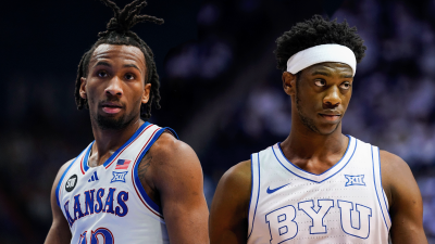
BYU’s all white uniforms are reminiscent of doctors’ coats. There’s not much intimidating about them.
The Ugly
USF
FINAL: ?? start to the season! Your Bulls are 1-0 and host NIU next Saturday at 7 p.m. pic.twitter.com/AgvwQgX8Fi
— USF Football (@USFFootball) September 4, 2016
Wow. Look at those things. Its almost as if USF tried to look like Oregon and failed miserably. Those uniforms are the definition of an eyesore.
Arizona
BYU vs. Arizona first half photos: https://t.co/0pKZH5XPNi pic.twitter.com/xBjtaHG8cb
— Daily Universe Sports (@DailyUnivSports) September 4, 2016
The same can be said for Maryland. While the Wildcats do have some outstanding primary uniforms, these alternates are just plain ugly.
Maryland
Can't stop the feeling! #FearTheTurtle pic.twitter.com/dMqW0E76E0
— Maryland Football (@TerpsFootball) September 3, 2016
This. Maryland is trying so hard to be Under Armour’s answer to Oregon, but these are just awful looking. The state flag should NEVER be used on their helmets or uniforms in ways that they were Saturday or have been in the past. We’ll likely see Maryland featured on this list again soon.
Jason covers SEC football for Saturday Down South.


