Graphic designers embedded in SEC athletic departments spend weeks every spring deciding how they want to approach the football media guide, a glossy and thick comprehensive history of their respective program.
The cover is one of the most important pieces of that adventure, an image that could make or break a publication. Most of the time, less is better. Catchphrases often miss their mark while an in-your-face graphic with too many players can be quite busy.
Looking at this season’s digital covers, there’s a few eye-catchers, but many should have been sacked before escaping the pocket in photoshop.
Which one is your favorite? You can click on the individual photos to enlarge them:
14. Texas A&M: Money trees are barren in College Station this season following the massive Kyle Field renovation and Kevin Sumlin contract extension, so the Aggies opted to be a trendsetter this fall and publish their media guide without a cover. No Johnny Manziel, no need right?
13. Arkansas: The Razorbacks took the throwback angle with their old-school cover, remembering a star-studded cast from 1964. Holding on to yesteryear seems appropriate after last season’s demise. Incorporating the backfield combo of Alex Collins and Jonathan Williams along with defensive stars Trey Flowers and Darius Philon would’ve been more relevant.
12. Florida: You’ve probably already heard the dumpster fire jokes in reference to the Gators’ cover, an orange blob that appears to be an attempt at flames coming out of the tunnel with players at The Swamp. The lead designer’s never heard of page balance with 3/4 of the cover showing absolutely nothing.
11. Ole Miss: Here’s where phrases can backfire. Excellent choice to reveal Cody Prewitt’s excitement as ‘An Ole Miss Rebel’ but where are the other preseason all-conference candidates? Bo Wallace, Robert Nkemdiche, Laquon Treadwell … You have multiple headliners at your disposal, so use them. And did someone turn out the lights in Oxford? Maybe a navy blue or scarlet hue would’ve worked better in the background.
10. Vanderbilt: The Commodores did a good job ignoring a new era of Vanderbilt football on this year’s cover, replacing first-year coach Derek Mason with high seas and a huge anchor. It looks like something designed in a junior high computer class, topped off by the bottom line “2014 Football Fact Book”. That doesn’t have us anxious to dive in.
9. Georgia: At first glance, the Bulldogs’ cover looks more Valdosta State than Georgia with the power V separating star players and a super fan. Though Georgia has a great one in Marshall Morgan, kickers never translate to covers, especially when the holder remains in the photo. Just give us a detailed Todd Gurley in the foreground with a beautiful shot of Sanford Stadium and we’re set.
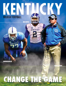
8. Kentucky: We see you Blue Nation. You’re making sure not to sneak up on anyone this season by including the names of your headliners on offense and defense and your head coach? The latter wasn’t necessary, but we get the idea. And smoke? Cool.
7. South Carolina: Oddly enough, this is the second 2014 SEC media guide without the school or team name on the cover. We’re guessing the Gamecocks’ traditional Block C logo was considered universally known. The graphic itself is intimidating with four veterans donning South Carolina’s preferred all-garnet home look with the Head Ball Coach front and center. The nicest touch is incorporating South Carolina’s helmet stripe. Love that idea and really creative.
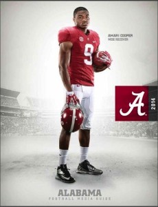
6. Alabama: The Crimson Tide has four covers this season, all simple and similar to Auburn’s generic look. Where designers went wrong was setting the program’s script A logo along the rail. Centered in the skybox or underneath Amari Cooper’s cleats would’ve set it off, unless they were going for the tabbed folder look.
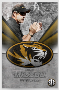
5. Mizzou: Basic’s good in this case for the defending Eastern Division champions. Who doesn’t love a granite fade — an ode to the Tigers’ rock ‘M’ I’m guessing — over a fierce team logo and Gary Pinkel?
4. Tennessee: Stressing the program’s ‘brick by brick’ philosophy was a bold move, but the Vols hit a home run with a cover that reminds us of a poster for a summer Hollywood movie. Butch Jones as the lead star? We’re in. Including Tennessee’s twitter handle was a nice touch, but the addition of a player or even Smokey would’ve pushed this design into the blockbuster realm.
3. Mississippi State: Turn up the contrast and what do you get? Three menacing standouts who appear ready to shoulder the expectations in Starkville this season. Three different uniform combinations was an interesting idea and it worked.
2. LSU: On rare occasions, going outside the box works and the Tigers’ vibrant 2014 cover is undoubtedly one of the league’s best. By incorporating everything you’d see on gameday in Baton Rouge besides the crawfish tailgate, the image puts you in the middle of what it means to be a Tiger.
1. Auburn: Bold. Elegant. Straightforward. The Tigers aren’t afraid to play fast and they’re telling you so. Nick Marshall sprinting toward the reader instead of away is a nifty idea. And there’s page balance despite the white space.


