SEC bowl helmet concepts: 2015 Edition
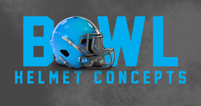
It’s an annual tradition here at Saturday Down South – well, at least, for the last couple years – where we roll out fun and creative bowl helmet concepts for each SEC team participating in a bowl game. You can view the 2014 edition here.
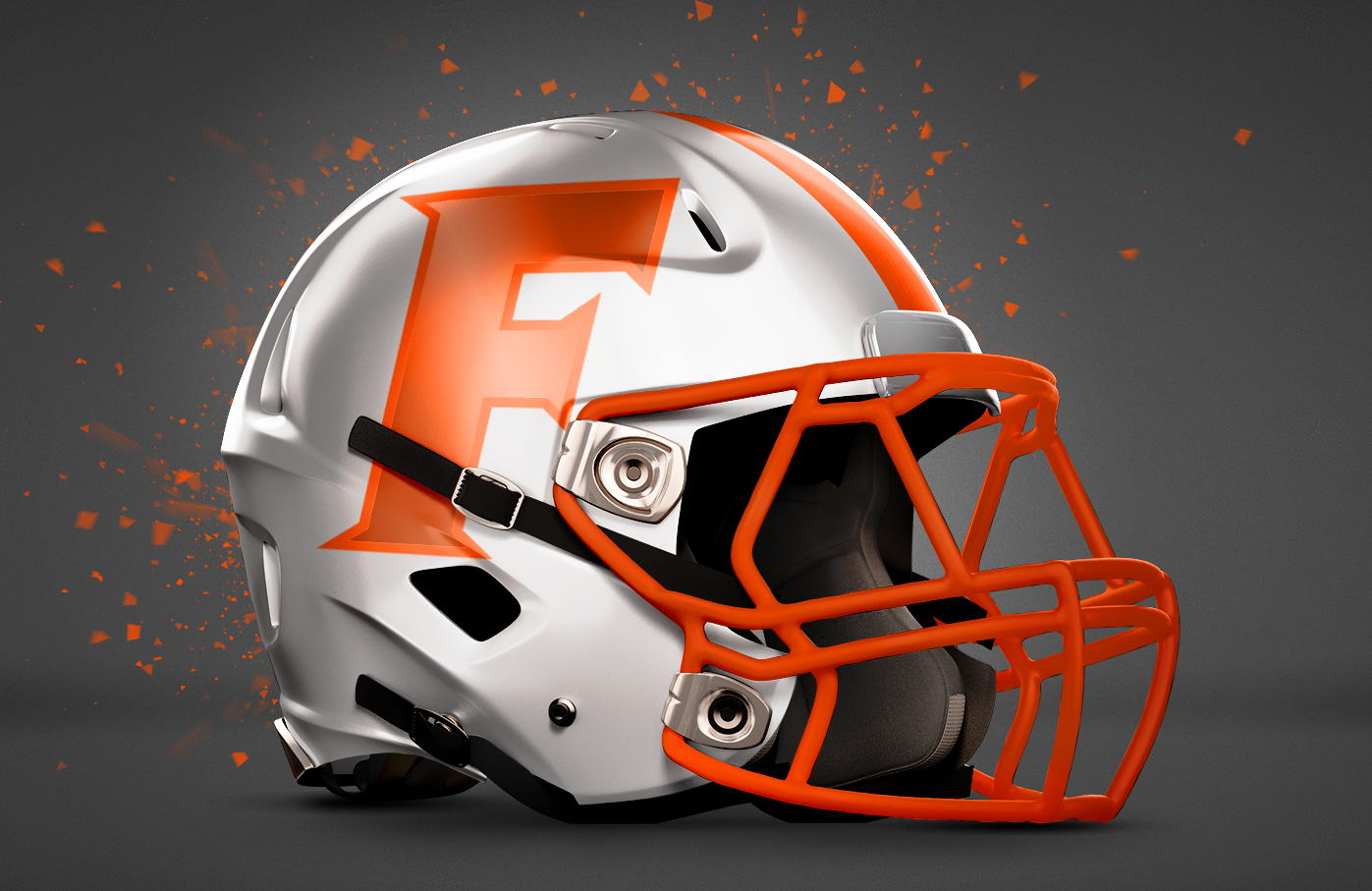
Florida (vs. Michigan) – Citrus Bowl
Florida is quite well known for its citrus fruit, and it just so happens that the University of Florida gets to play in the state’s iconic Citrus Bowl. McElwain seems to like those white helmets enough to break them out twice this season. As such, I’ll bet he’ll want something similar for their bowl game…
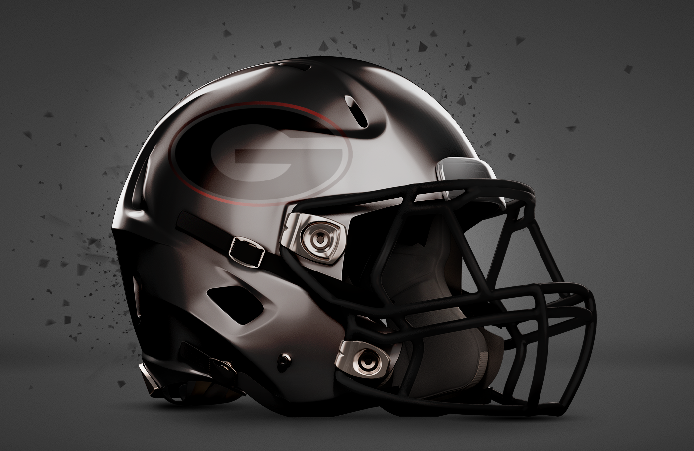
Georgia (vs. Penn State) – Taxslayer Bowl
When it comes to finances, everyone tries to go from the red into the black. So for the Bulldogs, it shouldn’t be hard since both are their primary colors. How about an all-black look with a subtle reflective “G” that’ll shine in the Florida sun.
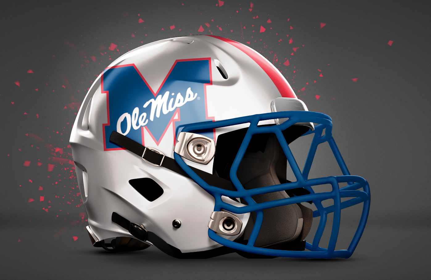
Ole Miss (vs. Oklahoma State) – Sugar Bowl
Ole Miss hasn’t been to the Sugar Bowl since 1970. That’s a long time, so I think a throwback is appropriate. Yes, almost all of Ole Miss’s logos look like throwbacks, so we went with the lesser-known alternate logo. All white helmets – like pure sugar – keep the Rebs looking fresh.
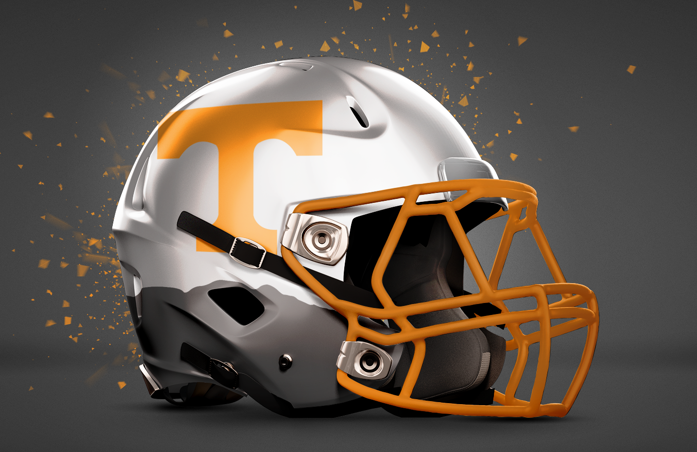
Tennessee (vs. Northwestern) – Outback Bowl
This one worked out perfect. Earlier this year, the Vols debuted their Smokey Mountain helmets, which featured silhouettes of the Smokey Mountains. In their special bowl game helmet, they’ll get similar treatment this time using the Outback Steakhouse logo’s Australian terrain silhouette. G’day, Vols.
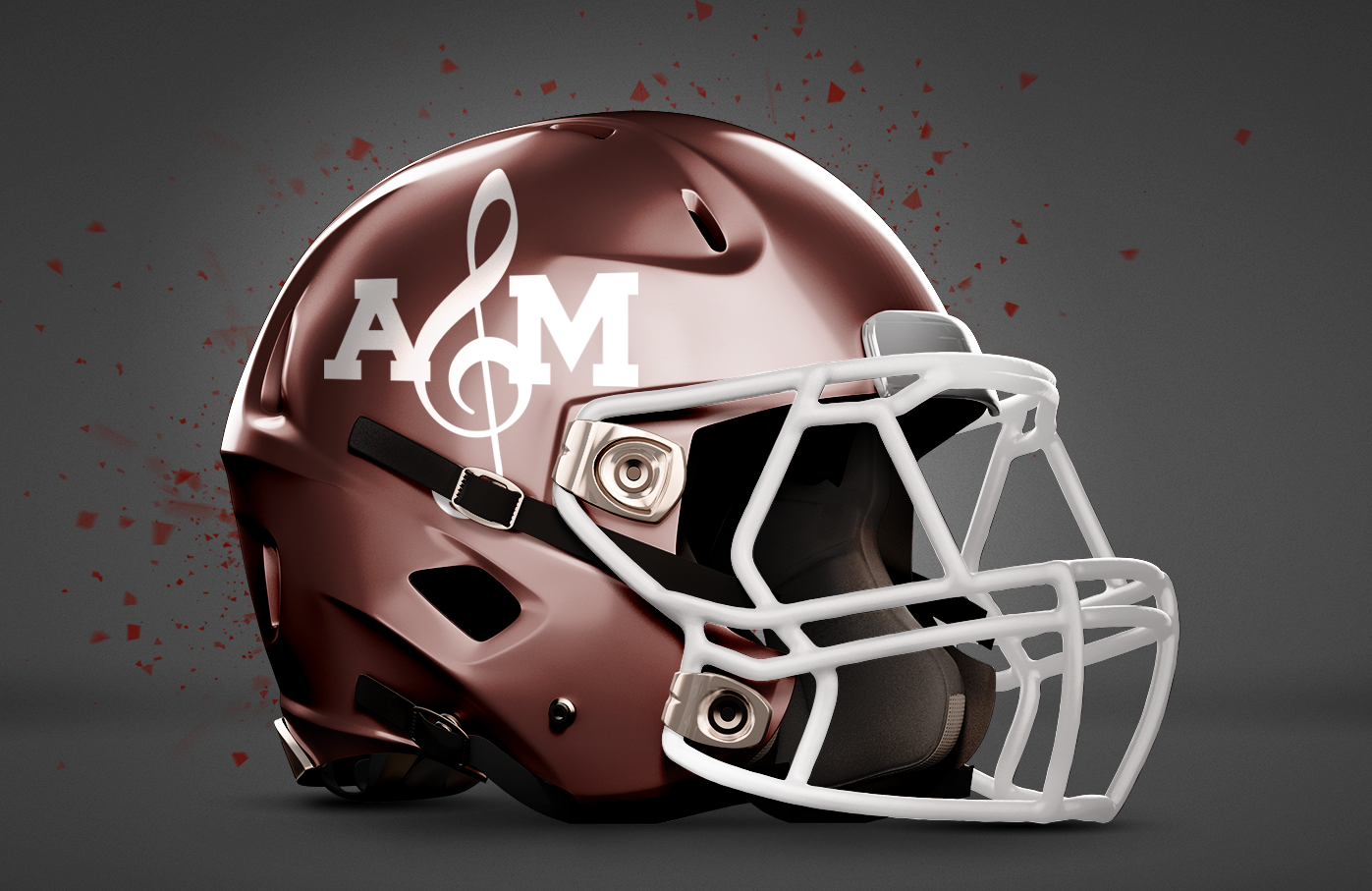
Texas A&M (vs. Louisville) – Music City Bowl
The Aggies will travel to Nashville, well known for its music. So replacing the “T” with a treble clef seemed appropriate. The only question was whether or not to bevel it. Plus, if you treat it like an ampersand – which, let’s face it, most people will think it is – then it simply says “A&M” which works out just fine.
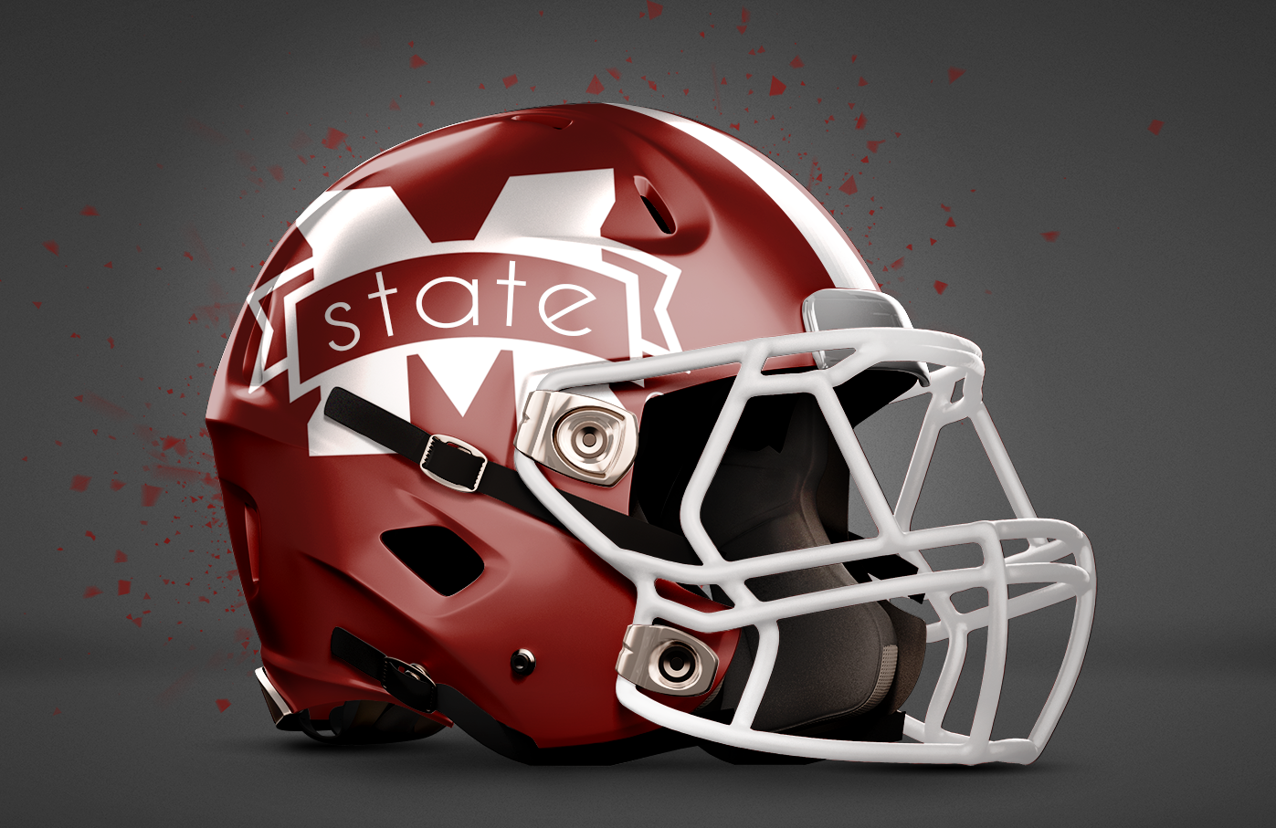
Mississippi State (vs. NC State) – Belk Bowl
Belk’s tagline is “modern. southern. style.” With that tagline in mind, the Bulldogs get to stick with their traditional southern helmets, but with Belk’s new font incorporated into the design giving the helmet a bit of a modern twist.
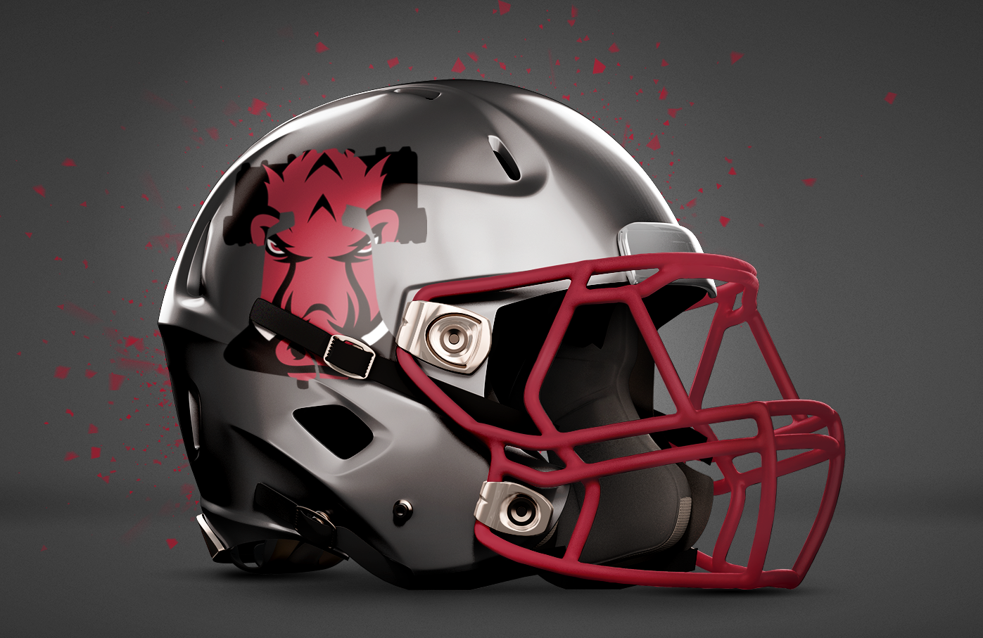
Arkansas (vs. Kansas State) Liberty Bowl
The Liberty Bowl, just like the iconic Liberty Bell, this bowl game is located in Philadelp…. oh, sorry, it’s in Memphis. Either way, the Liberty Bowl is named after the historic bell, which is why Arkansas’s vertical alternate logo is placed inside an outline of the liberty bell. The helmet is an ash-gray with a cardinal facemask.
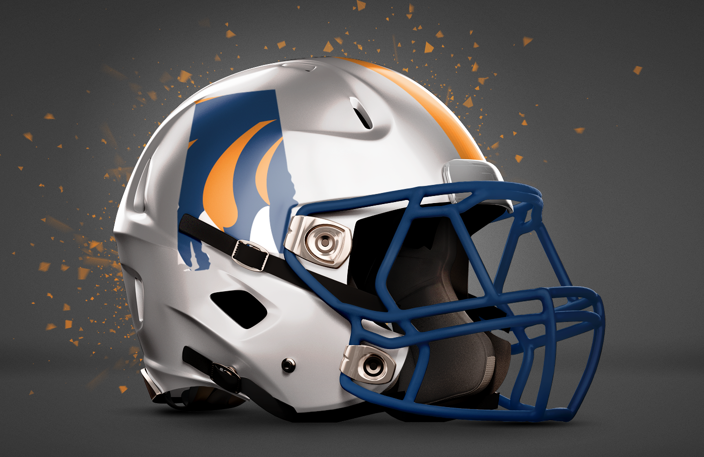
Auburn (vs. Memphis) – Birmingham Bowl
Auburn loves to say it runs the state – and considering its bowl game is actually 2 hours from their home stadium, they’ll be defending their state in their bowl game. And nothing makes Auburn fans happier than seeing Bama fans angry, so I say Auburn’s bowl helmets should feature the whole state of Alabama.
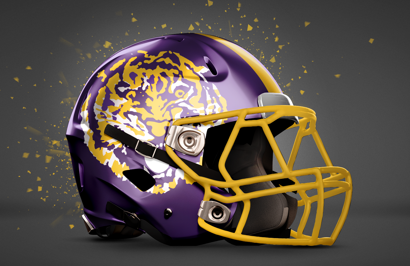
LSU (vs. Texas Tech) – Texas Bowl
Texas is all about heritage. So the vintage tiger logo (that crazy one from the 70s) makes sense. And since everything is bigger in Texas, why not have that tiger head real big? As big as the idiots who almost fired Les Miles. Okay, maybe not that big.
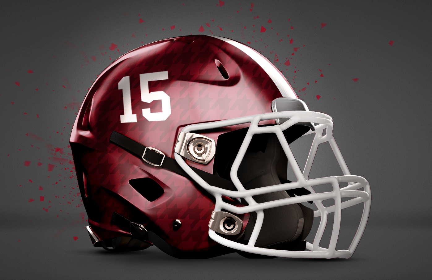
Alabama (vs. Michigan State) – Cotton Bowl
The Crimson Tide is not known to stray far from tradition. Which is why not much is changed from this bowl helmet at a glance. But if you look close, you can see a subtle houndstooth pattern that reflects in the lights of AT&T Stadium. The numbering is also updated a bit.
That Auburn helmet looks terrible, I really hope they never use that concept.
Maybe if it was a “State of Auburn” logo ?
At this point I think that design was a curse. Don’t get me wrong I thought it looked great, but ever since it came out Auburn has tanked.
I agree – the AU helmet is the worst followed by AR lol but it’s interested to see
Some are really good, Florida, LSU and Bama. Some are really bad like Auburn and Arkansas. Georgia is too light to even see it on the helmet. And I thought the A&M helmet was paying tribute to their own band, not Nashville.
Only LSU has a decent helmet here. The rest are just awful. Please stop doing these.
Exactly.
Agree with you, TC
That A&M helmet screams, “This one time at band camp…”.
I thought it was paying tribute to your amazing marching band.
Best LSU and its all down hill from there with Auburn on the bottom. Bama not to bad.
The Bama helmet looks like a bowling ball. Let’s just stick with the helme we had all season.
All season? or like.. Since Bama started wearing helmets?
Hahaha I was thinking the same
Yeah I bet Bama fans will be reeeallllly angry seeing Auburn play in the Birmingham bowl while they are in the playoffs
I think Arkansas should use those Liberty ones!
If they werent gray I would agree, but nowhere in its color scheme does Arkansas have any other colors but Cardinal and White. Like Alabama is only Scarlet and White. Georgia and South Carolina can do black because black is one of their colors.
Scarlet and white… seriously. They literally have CRIMSON in the freaking name! Dumbest comment on here this year by far.
The Scarlet Tide? I like it!
anthracite is and has been a part of the pigville color scheme for years, they wear those ugly ass “grey” unis at least once a year trying to look like the MAC south team that they are. This grey helmet is no worse than the white ones with the white pig that were used last year in an actual game.
54-46 (4OT)
Arkansas no longer wears the grey uniforms. Also, they don’t wear the white helmets anymore either.
I would bet my wife’s next paycheck that over the past two seasons poor lil ol MAC south Arky struck more fear into the hearts of SEC west HC’s than the passengers on the Gus Bus did.
This is the Auburn team that couldnt beat the worse Georgia team in 25 years.
Pretty sure Arkansas will have better luck than the last SEC team to play at the Liberty Bowl stadium.
Oh, and pretty much every one of these helmets are awful.
My comment was kind of a joke :)
Australian Terrain?? Nice job FLATHEAD!
Thank God Saturday Down South doesn’t actually get to decide what teams wear on Saturdays.
These are pitiful!!! WHO in the heck came up with this sad crap?? Seriously, the Florida and Tennessee helmets are exactly the same with a different letter on it. The only one that is remotely acceptable is the slight pattern in the Alabama helmet.
No
Gator helmets use a script Gators on the side.
Unless we go back to the Spurrier playing days where they had the single block ‘F’ on the side. I am not a fan of the new ‘F’ on the so-called throwback helmets. I also prefer our normal orange helmets with the blue script.
This proposed helmet is awful.
I did think the LSU helmet was the best of the group.
Agree. Why not a Gator with some teeth, which reps the defense. A rep for the offense would be toothless.
These are all (except for ta&m) pretty sick. Especially the Alabama helmet. I was surprised. I thought I would hate it. Hats off
Also no
LSU wins. but nah. I like what we got. I’d be fine with keeping our color scheme and using the 70’s tiger though. way cooler than current tiger.
The State and A&M ones are awful but none of them are great. You need to get whoever used to do the mock ups to do them again and not use whoever did them this year anymore.
I am typically not an alternate look guy. And the alternate concepts for Bama have pretty much been putrid. But I actually dig most of these especially as one-offs for bowl games. I actually think the Bama helmet is a great idea. Now, if Auburn wore that helmet, it wouldn’t make Bama fans mad. We may, however, require medical attention from laughing so hard.
Sooooo Arkansas clearly wins this battle, by a landslide!
So, nice!
Florida’s helmet looks way too much like Tennessee’s. All these are awful.
I thought the UGA hat was best of the bunch. Pewter always seemed a manly shade to me and the minimalistic flash free treatment screams we ain’t here for style points, just gunna kick your a$$ and be on our way. On the flip side, if Bear Bryant awoke and saw that Oregon has turned college football into a fashion show he would shi+ down both legs.
The G blends in too much on the dark background. Thanks but no thanks.
it’s designed to do that, it stands out when light hits it… think of it as camo…
LSU is the best followed by Tennessee in my opinion the rest are not so good
Not only are most of these just awful, but most of them are lazy, to. I do like the Ark and LSU ones, though. Please never deface our logo like that again.
TN and Australia all in one helmet? No please, it’s just too much fun to be having at this time of year, I can’t take it.
Did a 5th grader come up with these “concepts”?
Florida helmet is as boring as Bama’s.