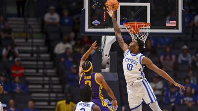
Big 12 Tournament shredded by social media for obnoxious court design
By Paul Harvey
Published:
The Big 12 Tournament is off and running from Kansas City’s T-Mobile Center! However, those who tuned into the basketball action may be left with more than they bargained for.
One aspect of the arena particularly stole the attention of everyone tuning in. That would be the court with a dizzying design that looks best reserved for your favorite abstract art.
Instead of the old-school hardwood paneling look, the court itself has a dark grey base. Then, it features light grey Roman numerals (XII for 12) stretching end to end in an interlocking fashion with a black border and a black and white midcourt logo.
Conceptually, it might have seemed interesting. In practice, it’s a wild mishap that should have a warning for looking at it directly for too long.
Heading into the men’s tournament off of the women’s tournament, commissioner Brett Yormark actually highlighted the court and spoke positively about the design and future possibilities with the “XII” branding:
However, while Yormark might love the design, the majority of social media does not seem to agree, at least as the men’s bracket tips off on Tuesday. Some described it as an assault on the eyes while others described it as a piece of abstract art. Meanwhile, a large contingent grappled to discern why such a design was approved in the first place.
Take a look:
Paul Harvey lives in Atlanta and covers SEC football.


