SDS Roundtable: Which SEC helmet absolutely needs to be redesigned?
By Chris Wright
Published:
Each SDS roundtable discussion involves the SDS staff providing individual answers and comments to questions covering a wide range of sports and non-sports topics. In this discussion, we ask the question: Which SEC team’s helmet would you redesign first?
Previous roundtable discussions:
- If you could change 1 thing about college football, what would it be?
- What are you watching right now?
- Who is your favorite SEC football player of all-time?
- What are your 3 favorite postseason moments involving SEC teams?
- Which 4 SEC athletes are on your Mount Rushmore?
- What is your most painful sports memory?
- The greatest team I ever saw …
- Which school’s all-time position group is the best in SEC history?
- Who are your way-too-early picks to make the College Football Playoff?
- If and when the SEC expands, which 2 teams should it add?
- Who is your pick to win the SEC East, SEC West in 2020?
- Who is your favorite player from every SEC program?
- Who is your favorite SEC personality to follow on Twitter?
- Which SEC program produced best pro sports duo?
- Which prop bet would you risk stimulus check on?
- Which former assistant is first to beat Nick Saban?
A bit of background …
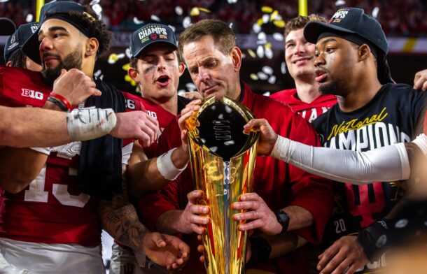
A few NFL teams — Browns, Bucs, Colts, Falcons — recently unveiled new or tweaked uniforms. College teams typically add alternate jerseys, sometimes a lot of them, but they rarely make drastic changes to their traditional look. That applies double to helmets. We see more and more alternate helmets every season, but the primary one almost never changes. Which team is in the biggest need of updating its regular helmet?
Connor O’Gara, Senior national columnist
Unpopular choice here, but I’d actually go with South Carolina. I only say that because I wish the Gamecocks would go all in with the script look, AKA “Battle Armor.” I feel like it’s such a massive upgrade over the current logo, which really doesn’t do anything for me. Like, isn’t there a reason everyone gets so excited when they busted out the script look ahead of the 2018 opener?
Battle Armor 🔥💧 pic.twitter.com/1dSw5p3HaJ
— Gamecock Football (@GamecockFB) August 28, 2018
The script Carolina is one of those alternate looks that should replace the “C” with the Gamecock in the middle of it. It instead blends a classic look with a modern touch from Under Armour. Would they ever do this? Probably not, because it does bare a similar resemblance to the script “Gators” helmets, but I’d put that helmet up there in the best in college football.
Chris Marler, The SDS Podcast co-host
I don’t really have an issue with any SEC helmets to be honest, nor do I have an overall favorite. If I had to get rid of one, I would say Vandy’s. I like the ones with the anchor and the V, but the old school block V inside the star is so meh.
Every time I see it I’m reminded of 12:30 Jefferson Pilot games that were way too sunny and often coupled with a terrible hangover. Also, part of me hopes one day Bama will do a blackout and wear all black helmets and jerseys just so I could see the 85% have an absolute meltdown.
Neil Blackmon, Florida columnist
The correct answer is Florida’s helmet or LSU’s helmet needs a redo (or redux, in the case of LSU).
The script Gators is only used on the football helmets and ranks about dead last of any other Florida options. Plus, the orange helmets are fine in the Florida sun, but anyone who has seen old video of Florida in the 60s or saw Florida’s white helmets with the block F that the team wore last season against Auburn knows there are far better options. Further, because Florida only switched to the script Gators 40 years ago or so, there’s no sentimental attachment to the helmet. It should be changed.
Likewise, LSU’s tiger head that doesn’t look like a Tiger head is terrible. The block letter LSU in logos is far beter, as is the baseball hat. If they can make such a nice cap for the baseball program, they can fix the helmet.
Michael Bratton, News editor
I don’t take issue with any of the SEC helmets necessarily, but the way Florida has “Gators” written out in cursive always seemed strange to me — and this is coming from someone who writes everything in cursive.
I like the alternate white helmets with the “F” on the helmet. If I redesigned the Florida helmet, I may do it similar to the Florida A&M helmet with a gator instead of a snake.
Considering there are so many Wildcats and Tigers out there, it’s pretty cool to be the only Gators out there, and I’d like Florida to embrace that more on the helmet aside from just spelling it out.
Adam Spencer, Newsletter editor
I don’t have anything against Mississippi State, but I just simply don’t like the color maroon. Thus, the Bulldogs’ helmet is the one that absolutely needs a redesign.
But, as I said, it’s more about the color maroon than anything about the helmet’s design. If I had to pick which SEC uniforms needed a redesign, I’d also go with Mississippi State, and for the same reasons. I don’t mind the white Mississippi State uniforms, but as long as there is maroon involved, it’s always going to be at the bottom of my list.
Chris Wright, Executive editor
Honestly, I’d change about half of the league’s helmets. Of the teams that use alternates most frequently, I’d certainly pick one of those over the standard game-day lid. Why Vandy wears anything other than this Battle Ready helmet is beyond me.
Vanderbilt’s new “Battle Ready” alternate helmet is SHARP. ? CC: @PhilHecken @UniWatch pic.twitter.com/575GefQUt7
— The Walmart Wolverine (@TheWalMartWolv) August 11, 2019
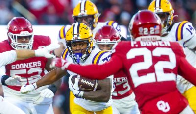
Which would I redesign first? Florida and LSU are wasting the biggest opportunity to have a cool helmet. Others already touched on Florda, so I’ll go LSU. It has the most potential.
First rule of helmet design: No letters and logo. Pick one or the other. And in this case, pick the logo. Heck, even the Gridiron Gold combo from 2016 — white helmet, gold and purple number on each side — was a drastic improvement over the LSU and tiger combo logo. I loved the purple helmet, but again, it was marred by having LSU and the tiger logo.
I’ve always been a huge fan of Clemson’s paw logo. There are a lot of Tigers — including 3 in the SEC — but Clemson created a unique look that is instantly recognizable. The 1981 national championship helmet Homer Jordan wore looks identical to the ones Deshaun Watson and Trevor Lawrence wore when they won titles.
It’s way too late to go anywhere near that logo design, so I’d focus on the tigers’ ferocity.
I’d choose LSU’s eye of the tiger as the official helmet logo.
It would look even better on the gold, purple or white helmets than it does at midfield.

Managing Editor
A 30-time APSE award-winning editor with previous stints at the Miami Herald, The Indianapolis Star and News & Observer, Executive Editor Chris Wright oversees editorial operations for Saturday Down South.